Dibz Rebrand & Checkout Flow
Meet the Team
-

Justin Nathaniel
Creative Director
-

Katie Silverstein
Lead Product Designer

📱 Overview: Introducing Dibz
Dibz is a London and Atlanta-based tech startup revolutionizing live event experiences through seamless, text-based interactions. Positioned at the intersection of technology and entertainment, Dibz partners with top-tier organizations—including the NHL, NFL, NBA, MLS, NASCAR, and Ticketmaster—to offer fans a smarter way to engage with their seats.
At its core, Dibz is a full-service texting engagement platform built for professional sports and concert venues. Its flagship feature allows users to upgrade their seats in seconds—all through a simple text message. By eliminating the friction of apps or in-venue lines, Dibz transforms premium seating into an intuitive, mobile-first experience.
How it works:
Send a Text
Select Your Seats
Confirm & Enjoy
Upgrading has never been easier—or faster.
🚧 The Problems
Despite the innovation behind Dibz’s text-based seat upgrade experience, the platform faced several critical issues that were limiting user trust and conversion—particularly at a time when momentum was crucial. This 3-week design sprint was initiated ahead of an important investor meeting scheduled just five weeks out, adding urgency to streamline the experience and elevate the brand’s digital presence.
Here were the core challenges we set out to solve:
Lack of Clear Brand Identity
Dibz lacked a cohesive brand vision. Without established brand guidelines, the platform's visuals felt disjointed and inconsistent—leading users to perceive the service as potentially unreliable or "sketchy," which eroded trust at crucial touchpoints.Checkout Flow Dropoff
While users found the checkout process simple to navigate, feedback and data revealed a significant dropoff before reaching the payment stage. The interface suffered from minimal visual hierarchy and lacked the polish that would signal trustworthiness and legitimacy.Post-Purchase Confusion
Once users completed their upgrade, many were unsure how to present or communicate their new seats to event staff. This post-purchase gap created frustration and reduced confidence in the overall experience
⚠️ Brand Emergency: Building the Foundation First
Before we could even begin solving for usability or product flow, one issue stood out immediately: the Dibz brand was fragmented and underdeveloped. It had a logo—but little else. This wasn’t just a design problem—it was a trust problem.
As Creative Director, I made the call to break from the typical design sprint process and address this foundational gap first. Working closely with the founder and CEO, we aligned on three essential pillars that would define the Dibz brand and guide every design decision moving forward:
1. Mission
While Dibz had a rough mission in place, it lacked clarity and precision. We refined the language to clearly articulate what Dibz is, who it serves, and what makes it valuable. This was vital not only for users, but also for investors evaluating the business at a critical early stage.
2. Voice & Tone
There was no defined way for Dibz to communicate consistently across marketing or product. We developed a clear voice and tone framework—capturing the company’s personality, values, and attitude. This became essential for user-facing copy, pitch decks, and brand communications.
3. Visual Design
The logo had already been commissioned before I joined. Given that we were gaining investor traction and needed to be strategic with funds, we made the decision to retain the logo but update its formatting from JPEG to SVG for scalability and better integration with partners.
From there, we established:
A defined color palette (Yellow, Black, and Navy) with detailed hex, Pantone, RGB, CMYK, HSL/HSV values
Typography selection and commercial font licensing
Logo lockup usage rules across different placements
A comprehensive brand guidelines document, including do’s and don’ts for internal teams, marketing, and affiliates
This foundational work didn’t just polish the surface—it made everything that followed more cohesive, strategic, and trustworthy. It set the tone for a product and experience that users (and investors) could believe in.
More than just a logo!
🔍 Discovery & Research
Our research phase aimed to validate our assumptions and uncover the friction points in Dibz’s mobile checkout flow. The early qualitative data—collected through on-site surveys during a pilot rollout—had already revealed friction in the user experience. But we needed a deeper understanding before redesigning.
📊 Existing User Feedback
Initial survey data from pilot venues revealed an alarming trend: while users appreciated the idea of a seamless upgrade via text, many dropped off before completing checkout. This insight pointed us toward the checkout experience as a major opportunity area.
🧭 Competitive Analysis
To understand how Dibz compared with its direct competitors, we conducted a focused analysis of Ticketmaster and Stubhub—two giants in the event ticketing space. Though time constraints limited the breadth of the study, we prioritized mobile platforms, as they were most relevant to our use case.
We analyzed:
Total number of clicks to completion
Payment methods offered (e.g., Apple Pay)
Form structure and alignment (stacked vs. inline)
Use of input fields and labels
Nomenclature and user flow architecture
Key Takeaways:
Both competitors emphasized minimal clicks to checkout.
Their checkout flows used clean, stacked, left-aligned forms.
Multiple payment options were standard—offering users flexibility and security.
Strong visual cues and clear language created a more trustworthy user experience
📈 Quantitative Testing
To quantify abandonment rates, we first mapped out the existing checkout task flow and used that as a basis for moderated testing via UserTesting.com.
Findings:
Only 40% of users successfully completed the full task flow without error.
32% abandoned the process entirely.
The majority of users expressed hesitation about entering their credit card information—suggesting a trust and security gap.
When asked to choose between seating options (System A = Best, B = Better, C = Good), over 50% selected Option B, hinting at a tradeoff between proximity and price that we aim to explore further in future testing.
🧠 Expert Interviews
To complement user data, we conducted interviews with two subject matter experts:
A representative from Major League Baseball (MLB)
A seasoned ticket scalper, who participated under the condition of anonymity
Insights from the Experts:
Proximity and access are high-value drivers—users will pay more for a better view or closer experience.
Memorabilia matters—for many fans, the experience includes collecting tickets and playbills.
Both experts expressed frustration with Ticketmaster’s dominance, which often limits availability and inflates prices for everyday fans.
👥 Personas
To design a mobile checkout flow that genuinely met user needs, we first had to understand who we were designing for. Through survey responses, user interviews, and pilot testing data, we synthesized three core personas that represented Dibz’s key user types:
🧔🏽♂️ Sebastian — The Sentimental Father
Wants to create lasting memories with his daughter by upgrading their seats to make her first game unforgettable. He values ease, speed, and family-friendly perks—but dreads long lines, crowded venues, and navigating over people mid-game.
👵🏼 Ciara — The Traditionalist
A devoted fan of performing arts and live events who loves collecting tangible keepsakes. Ciara is skeptical of digital tools, prefers paper tickets, and is hesitant to trust unfamiliar brands or technology.
💁🏽♀️ Ashleigh — The Tastemaker
A social connector who attends events with large friend groups. She values transparency, verified platforms, and the ability to upgrade blocks of seats. Her decision-making is heavily influenced by trusted sources.
🗺️ Mapping the Experience
While all three personas provided valuable insights, Sebastian became our primary focus for this sprint. Since our next investor pitch was tailored toward sports tech investors, following a sports-related use case allowed us to demonstrate the direct impact of Dibz in a stadium environment.
We created a detailed user journey map to visualize Sebastian’s experience from arrival at the venue to the event’s end. This map highlighted his:
Actions at each step
Emotions and points of friction
Thoughts and expectations
Touchpoints with Dibz
Opportunities for improvement
Pitfalls that could break trust
This journey helped identify moments of hesitation—like “What’s Dibz?” or concerns about pricing—and spotlighted how brand perception, trust, and usability would be crucial in the redesign of the checkout experience.

🎨 Design & Ideation
The original checkout flow wasn’t just flawed—it was fundamentally underdesigned. With poor user reception and outdated infrastructure, we saw this as the perfect opportunity to rebuild the experience from the ground up.
📌 Grounded in Research
Our research findings informed every feature decision. To viably compete with major players like Ticketmaster and Stubhub, we needed to match their functionality while improving on trust, clarity, and user delight.
🗺️ Rethinking Venue Diagrams
One major insight from our competitive analysis was how prominently venue diagrams featured in competitor flows. Dibz, by contrast, had been using static JPEG maps hosted on our own servers—a method that was not scalable.
We partnered with engineering and identified a quick, cost-effective solution:
➡️ Switching to a venue API that served real-time, interactive maps.
This change opened the door to:
Better-looking, responsive diagrams
Inline map thumbnails in text messages
A foundation for scalable growth and future partnerships
✅ MoSCoW Prioritization
We used the MoSCoW framework to prioritize feature development:
Must Have: Interactive venue maps, clear pricing, new payment methods, visual trust cues
Should Have: Branded ticket visuals, digital wallet integration
Could Have: Promotional offers, nostalgic UI moments
Won’t Have (this time): Full loyalty program or in-app live support
✍🏽 Sketches to Systems
Armed with a refined task flow and a week left in our sprint, we:
Skipped mid-fidelity
Jumped straight to high-fidelity wireframes
Built a lightweight design system using the brand guidelines we had just finalized
This system helped unify Dibz’s visual identity and made production-ready UI components that could be reused in future features.
🛠️ Key Design Decisions
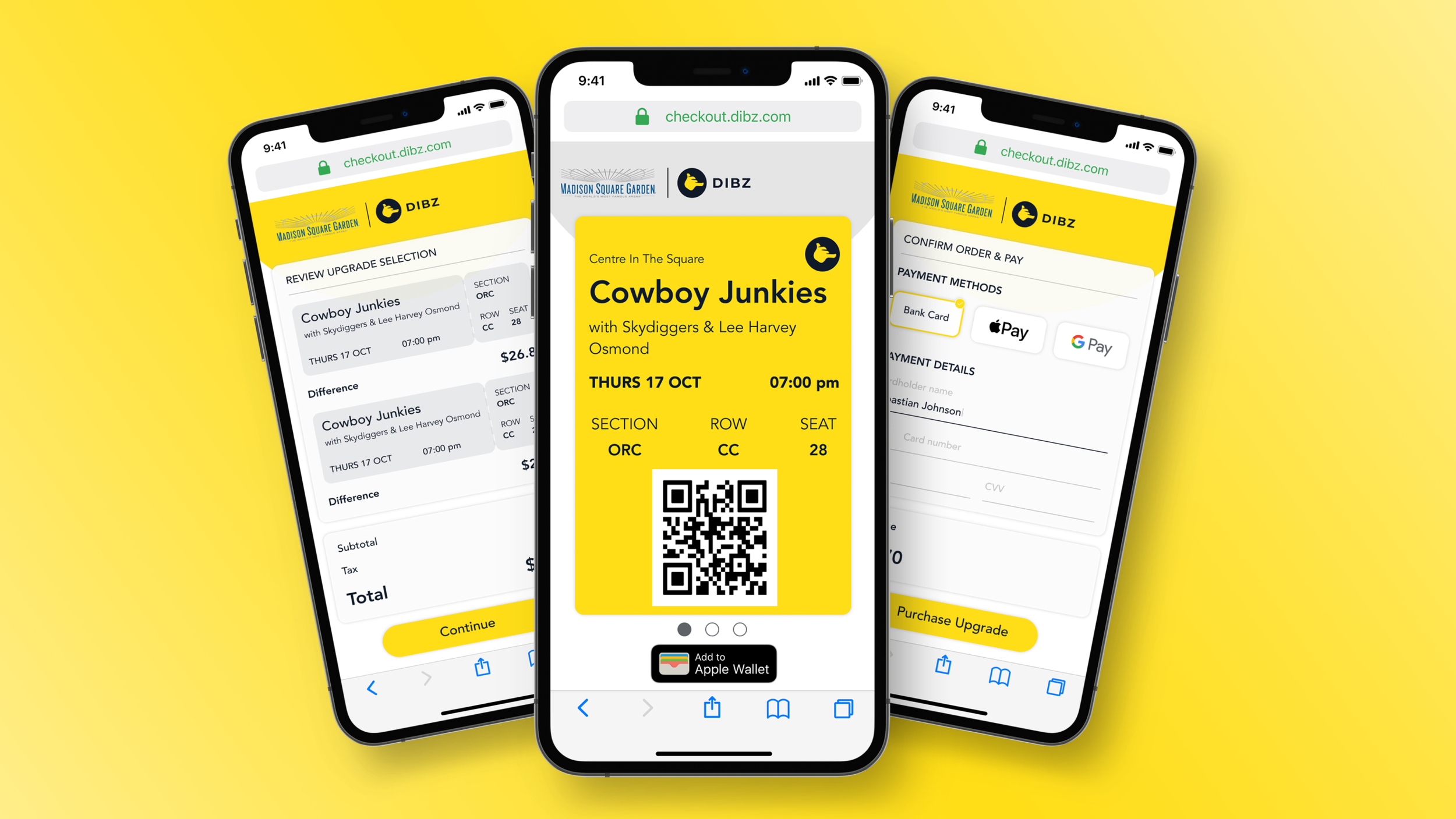
1. Upgrade Review Page (Step 1)
Our goal: Build trust.
Clean, visual breakdown of seat selection
Transparent pricing—no surprise fees
Each selection styled like a physical ticket, complete with “perforated segmentation” for a nostalgic touch
2. Payment Page (Step 2)
Our goal: Remove friction.
Added Apple Pay and Google Pay integration with low implementation cost
Catered to users who were hesitant to input sensitive card details, especially CVV codes
Helped align Dibz with industry standards
3. Success Page (Step 3)
Our goal: Celebrate and reinforce.
Bright, branded confirmation using our signature yellow
Large, scannable barcode—a visual affordance users instinctively understand
Options to add to Apple Wallet or Google Wallet
Conditional callouts for venue-specific perks like food & drink vouchers, encouraging repeat use and boosting partner revenue
🏟️Dibz Demo
From Nosebleeds to Front Row: How Dibz Upgrades Work
🔭 Next Steps
While the redesigned mobile checkout flow significantly improved trust, clarity, and scalability, this sprint opened up new areas for refinement and experimentation—particularly as Dibz continues to scale and expand partnerships with sports and entertainment venues.
Here’s where we plan to go next:
🧪 A/B Test Seating Labels
In testing, over 50% of users selected Option B (“Better Seats”) when presented with a tiered seat selection (A = Best, B = Better, C = Good).
We suspect this may be due to users balancing proximity versus price, but we want to confirm.
Next steps include:
Testing different naming conventions (“Premium,” “Close View,” “Budget-Friendly”)
Running experiments with visual previews and price comparisons to reduce decision anxiety
📉 Further Reduce Abandonment
With a 32% checkout abandonment rate, there’s still room for improvement. Potential tests include:
Introducing subtle progress indicators to show users how close they are to completion
Personalizing payment pages with trust badges, especially near form fields
Exploring pre-filled options when users return via SMS links
🧾 Print-Friendly & Collectible Ticket Options
Based on user personas (especially Ciara), we’ve identified a desire for tangible memorabilia.
Future enhancements may include:
Optional print-at-home commemorative tickets
Digital keepsakes that can be shared on social media or saved to a memory vault within the Dibz platform
🤝 Venue-Specific Features
Several venue partners expressed interest in using Dibz for in-venue promotions. We plan to:
Test contextual offers (e.g., “Upgrade your seat + get 20% off concessions”)
Build lightweight CMS features for venues to update maps, perks, and offers in real-time
🏁 Conclusion
This project was more than a checkout redesign—it was a pivotal reset for Dibz as a product, brand, and business. In just three weeks, we took a fragmented, underperforming flow and transformed it into a user-centered, scalable experience that reflected Dibz’s value and ambition.
By grounding our decisions in user research, aligning closely with engineering, and reestablishing the brand’s visual and verbal identity, we built a checkout experience that was not only faster and more trustworthy but also delightful and emotionally resonant.
From scalable venue maps and flexible payment options to transparent pricing and nostalgic UI touches, every element was crafted to meet user needs while positioning Dibz for long-term growth. And with a successful investor pitch just around the corner, this sprint helped set the foundation for a product that’s ready to scale, excite, and win over future investors.


