ACLU Mobile Justice App
We The People: Remastered
Meet the Team
-

Kristin Kerney
Program Manager
-

Justin Nathaniel
Lead Designer
-

Noura Ibrahim
Researcher

Overview
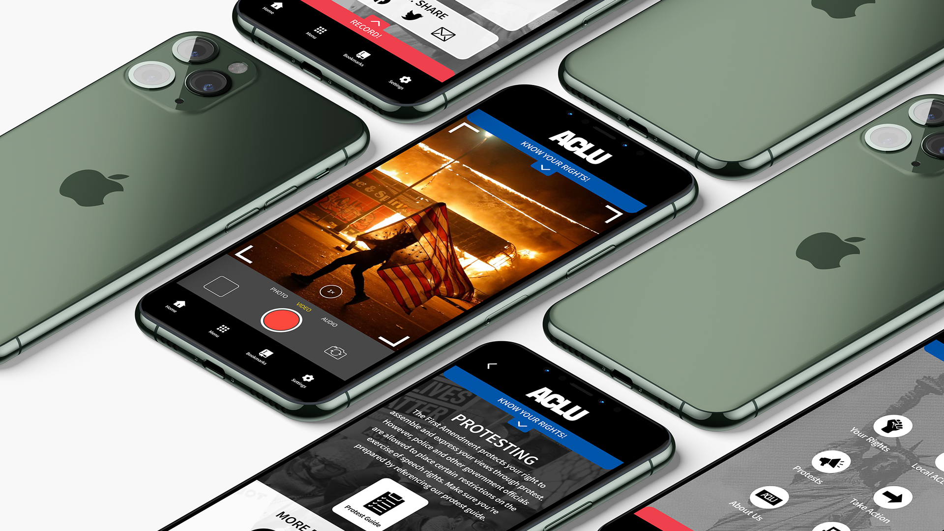
The ACLU Mobile Justice App is a powerful tool designed to empower individuals by enabling them to document and report instances of police misconduct. It serves as a digital ally in upholding civil rights, providing users with the ability to securely record and upload footage directly to the ACLU.
This case study explores the 2 week design sprint redesign process of the Mobile Justice app, focusing on enhancing accessibility, usability, and trustworthiness.
About the ACLU
The American Civil Liberties Union is a non-profit organization founded in 1920 “to defend and preserve the individual rights and liberties of every person in this country and the Constitution and laws of the United States.”
The Current Mobile Justice App
The latest version of the mobile justice app allows users to:
Record: Encounters with public officials and law enforcement.
Report: Any abuse by authorities to ACLU and its networks.
Empower: All users with up-to-date information regarding your rights.
While the video recording/witnessing feature is fleshed out and useful, the “Your Rights'' section feels tacked on and incomplete. The information is correct, but the content itself is laid out in a sprawling, wiki-like list that - contrary to the quick-record feature - would be virtually useless in the event of an emergency. The ACLU wants to create a better way of navigating this critical information.
Users would have to select the “i“ icon to access the Know Your Rights section
Utilizes a vertical list of rights
User Research
We sought to deepen our understanding of user needs by conducting 7 usability test, 7 user interviews and consulting 2 subject matter experts.
Competitive Analysis
Then we conducted a competitive analysis of 3 apps within this niche. This helped us to determine best practices and heuristics for apps in this categorgy of social justice.
Affinity Mapping
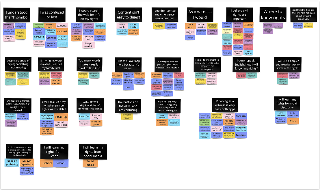
This is where we faced a major challenge to our 2 week time constraint. We had an overwhelming amount of data from our various sources. To make senes of it all we utilized an affinity map to help us identify information hotspots that appeared frequently in our observations.
Key Findings
About 1,000 civilians are killed each year by law-enforcement officers in the United States
Black men are 3 times more likely than white men to be killed by police during their lifetime.
0/7 user were able to navigate to the Know Your Rights section without error.
Other than recording, users were unsure how to use the Mobile Justice App homepage
5/7 users stated that they did not trust where the captured video was going.
How Might We
With our key findings we created some HMW questions to help us further narrow our focus and think through the challenges we hypothesized users were facing.
Persona: Amira
Amira needs a resource that provides her with the pertinent civil rights information and relevant laws so that she can confidently lead her peers in demonstrations.
Motivations
To demonstrate in a way that’s lawful and civil.
To uphold civil rights for all.
To be seen as a leader in her community.
Wants & Needs
To be able to find relevant information.
To prepare for protests, including worst case scenarios.
Frustrations
Not being able to sort through the vast resources available on the internet.
Being overwhelm with where to start.
Initial Designs
We started with an exercise to produce low fidelity wireframes. Using the affinity map information and the insights from the user testing we were able to define what features we needed to incorporate and assign them a level of priority to balance against the time frame before presenting to stakeholders and engineering teams.
Mid Fidelity Prototype
As the Lead designer there was a pressure to rapidly reach the prototyping phase. This was determined to be the best way to showcase the user experience most effectively. So after receiving feedback from my team I rapidly developed a prototype in mid fidelity; making edits to the original information architecture and copy to tackle one of our biggest pain points during user testing, clarity.
Post Sprint
With the 2 week time over we were able to deliver the core asks from the scoping document. After a review with stakeholders we were given another 3 days to align to the ACLU brand guidelines. A document that is over 150 pages long!
We defined the color scheme that adhered to the guidelines; Made the app work for light and dark mode, and added loading screens.
